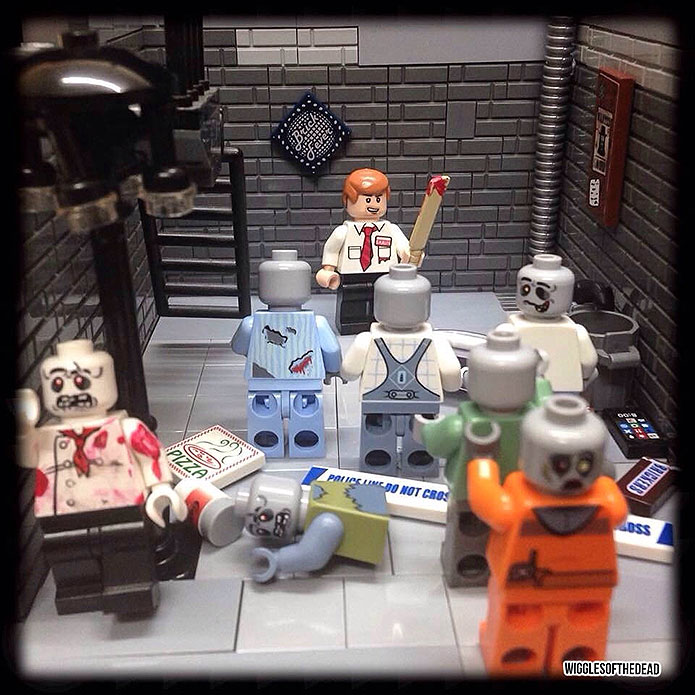
This week’s LEGO Zombie Creation comes to us from Wigglesworth Clarke and is called “Alley of the Dead“. Now, this is a pretty descriptive title, and you might assume that the creation is perhaps set in an alleyway will with zombies. And, in this case, your assumption would be absolutely accurate. See what I mean:

What’s Going On?
We’ve got a sole survivor – Shaun from Shaun of the Dead in this case – find himself at the end of a dead end alley with quite a few zombies closing in on him. He’s armed with his trusty cricket bat, and may be able to take out the zombies we see without getting bitten, but I think it’s safe to assume there are even more zombies closing in, just out of frame.
Of course, he is lucky enough to have access to a fire escape; the ladder is even down, which is a stroke of luck indeed. If I was Shaun, I’d be making a run for the fire escape and pulling up the ladder, post haste.
What I Like
Wigglesworth really makes excellent use of the brick bricks here, giving the alleyway an excellent, gritty texture that works well with the scene. I also like a lot of the details here, like the gutter downspout in the corner. Also, LEGO trash can!
What Could be Improved
The zombie in the foreground’s head is facing the wrong way. Now, that’s a dual-sided head, so I see why it happened, but since we can’t see the zombie’s actual face, it seems like an odd and distracting choice. I understand that all the zombies here are bald, and that is probably a deliberate decision, but it just doesn’t work with the choice of head here.
Second, I think he went a little overboard with all the printed pieces. I like the use of them, but there’s a lot of them, and they tend to pull the eye away from the rest of the scene.
If you want to get a head (with two expressions) get a hat. 😉
Or just use a different head, since it’s not facing the camera anyway.
or just blank gray heads
Oh wow, thank you. Really chuffed to be featured the shot was taken quite late at night and I was tired and got a little frustrated. On hindsight a lot of things could be improved mainly the lack of hair and the double sided head. I’m at the moment without a PC so all my photos are taken with an IPhone 5c and then the picture is transfered to my iPad and edited. The printed tiles didn’t really achieve what I wanted, I was trying to give an element of rubbish. But thank you again
Just tell folks it’s a badly broken neck and his head is supposed to be pointing backwards. 😉
Oh, that’s an excellent justification! Well done, Mick.
Ta very much. 🙂
My pleasure, Wigglesworth! Really an excellent little build, more so now that I know you did it in the middle of the night and only on mobile devices.
We clearly see Shawn at the first look…
…that’s why the job is doing well!
It’s always nice seeing Shaun. No doubt about it.
Just wanted to say thanks again, great feedback from you all. 🙂