There’s a lot of zombie stuff out there, and most of it is crap. People like to jump on bandwagons and produce quick tie-ins rather than investing love and effort into their creations. Luckily for you, I’m here to help separate the wheat from the chaff. Check back every Thursday, when I’m going to share the coolest zombie-related creation I can find out there on the web.
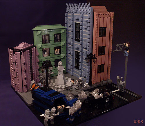
This week’s creation, “Zombie Attack” by Lego.Skrytsson, really shows how great staging and photography can elevate and already fantastic build to impressive new heights. The dark backdrop really accentuates the mood of this model, adding to the sense of chaos and doom. Lego.Skrytsson also uses some interesting camera angles to both show off his work and build tension.

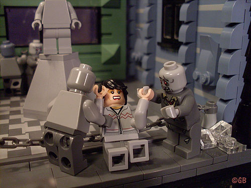
Here’s a close-up of the carnage. This poor lady is getting mobbed by two zeds, while others are tearing things up in the background. Beyond the story-elements here, I absolutely love the textures on the buildings. The repeated slopes make things visually interesting, and each building has its own personality.

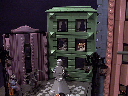
This broken glass here? Fantastic! I also love the apartment dweller looking down on the chaos in horror. Participants in the 16×16 Challenge should probably take note.

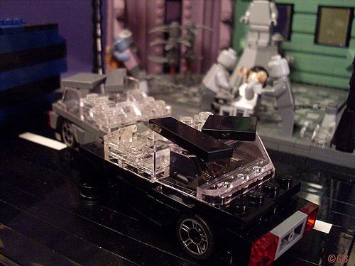
Want more destruction? Then check out these cars, both of which have seen better days.

I only featured a handful of photos from this creation. Do yourself a favor and check out the whole set. It’s absolutely fantastic. Not only is the build imaginative and unique, but there’s a really well-told story here as well. My only criticism is that I want more! More!
Have you seen a great zombie creation out on the web? Are you working on the next great zombie MOC as we speak? Well you had better let us know right away, otherwise we’ll never be able to include it here.
Those buildings remind me of Liverpool, England’s Albert Dock they have these nice alcoves where there are cafes and in one, the original Beatles practice basement. It’s a museum now.
I’ve never been, but it sounds pretty amazing.
The use of these rare colors makes this build pretty unique. My favorite detail is the guy who has climbed up the streetlight… makes me want to say “now what, you moron?!”
I know it’s not zombie related but you should also check this other build from the same builder – the forced perspective is stunning.
Now that’s a Batman set I’d love to have!
I thinking that this reminds me of the Lego Batman game. Looks awesome!
The color is amazing in this. Just amazing.
I’m glad you like it! It was my entry for the Eurobricks Lego Batman-contest. I actually won the contest. http://www.eurobricks.com/forum/index.php?showtopic=63699
The dog getting eaten on the Flickr page is great. I love the head with the goatee as well. Very nice indeed.
Oh and the zombies at the bottom of the lightpost just made me laugh. “But… how are we gonna eat him if he’s way up there?”
That’s zombies for you.
Hello. I’m the builder behind this creation. Thanks for the feature, much appreciated.
I’m glad everyone seems to like this. The colours are ment to create a feeling of darkness; that the city is kind of sorrounded by a shadow. I would maybe say that it is inspired a little by Tim Burton, someway.
Feel free (if you want) to take a look at my other Apocalypse-creation; with Aliens instead of zombies: http://www.flickr.com/photos/55631421@N03/6615484029/
Hey Lego.
Tim Burton-coloring is pretty dead on. I don’t know why I didn’t think of that in the write-up, but it’s perfect!
I did see the alien creation when I went through your feed. Hilarious! As is the men versus women thought bubbles.
I’m definitely a fan of your building style.
I love the beared face you use – I guess that’s Captain Jack?
Yes, that’s correct
My goodness I love the colors used here!
i love the way the buildings pull in and push out witth all those dark and dull colors also like the statue