There’s a lot of zombie stuff out there, and most of it is crap. People like to jump on bandwagons and produce quick tie-ins rather than investing love and effort into their creations. Luckily for you, I’m here to help separate the wheat from the chaff. Check back every Friday, when I’m going to share the coolest zombie-related creation I can find out there on the web.
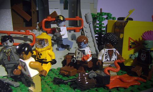
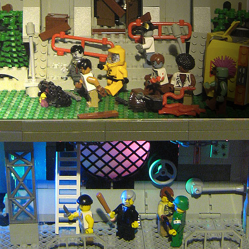
This week’s entry, “The Coast is Clear” by Retrograde, combines a fantastic vertical build, interesting zombies, and dark humor to great effect.
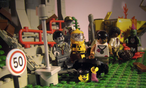
Let’s start with the zombies. Retrograde uses a unique face for each zombie, and gives each one its own personality. My personal favorite is the hazmat zombie with the cracked faceplate (nicely done, by the way), with a close runner up being the afro zombie. Suffice it to say, this is a fun horde.

The humor comes from perception, specifically, the perception of the scout who gives an all clear to his fellow survivors after a quick peak on the surface. Had he just turned around, or possible stopped to listen, things could have turned out differently.

Finally, this is one of the few contest entries with a vertical element. We get a nicely constructed (and appropriately destroyed) street scene on top, with the relative safety of the sewers below. A clever manhole connects the two.

Have you seen a great zombie-related creation out on the web? Are you working on the next great zombie MOC as we speak? Well you had better let us know right away, otherwise we’ll never be able to include it here.
I’m so glad you featured this one. I loved it!
It’s a fantastic entry. Like we kept saying, it was really tough to pick a winner.
Sweet! I think it’s cool that zombies can be looked at from a horrific and/or, in this case, comedic view.
As do I. Shaun of the Dead being a rare standout, I find most zombie comedies tiresome.
Does it all come back to that godforsaken “Braaaaaains” movie starting that mess of a trend?
You know, I’m actually not sure whether Return of the Living Dead was the first zombie comedy. It’s the first one I’m aware of, though.
Not a fan.
Zombie movies…mainly awful
Zombie books…mainly awesome
Two totally different types of storytelling and styles yet using the same antagonist.
Someone one a zombie site should do a well thought out blog post explaining the differences and why it exists. Maybe focusing on the social and culteral contexts of each.
FML
I really got to start proof reading stuff before I hit “submit comment”
That’s a damn fine blog idea right there. Lot’s of different angles to consider. I think the two biggest would probably be:
1. Cost – Movies, even shitty ones, are expensive to produce. Because of that, companies are less willing to take risks since they need to appeal to a big enough audience to make a profit. Books, especially in the age of print-on-demand publishing, are relatively cheap.
2. Number of People Involved – Writing a book is generally a solitary endeavor. Sure there are people who write in tandem or small groups, but they’re the exception. Making a movie involved dozens, if not hundreds of people. It’s a lot harder to capture a singular vision, even with a strong director.
This was one of my top choices…
Without a doubt.
Man, I totally missed that this was the featured MOC this week! Moving the “creation of the week” to Thursdays has really thrown me off, I think…
Anyway, this was always one of my favorites. I thought that either this one, or Yatkuu’s entry would be the winner. I was actually thinking that this one seemed better than Yatkuu’s in some ways (the scale, the originality, etc.)
I liked how the above-ground lighting turned out kind of grey and desaturated, and I also thought the sewer lighting was really cool. The whole build is just generally awesome with great structure and details, from the valve in the sewer, to the boarded up doors on the building, even the bullet holes in the walls (which I don’t think are even visible in these shots.)
I loved the irony, too! It was brilliant.
And one thing that I didn’t notice the first time I glanced at the pictures was the cracks in the HAZMAT zombie’s face shield. I have no idea how that was done, but it turned out to be incredibly awesome!
Once again, it’s a great MOC all around. I thought Yatkuu was the best choice for a winner, but part of me still would’ve liked to see this MOC win instead. It was seeing this MOC that inspired me to step up my game for my own MOC for the contest.
Thanks so much for all the kind words here guys! I had a great time making this and I look forward to the next contest!
My biggest regret in retrospect was using the same style of har on so many of the minifigs. Six out of the thirteen have the same smooth hair piece. That’s pretty lame if you ask me. But one thing I have learned is to snap a few preliminary shots and look them over carefully. Then fix things and take the final shots when it’s all set.