There’s a lot of zombie stuff out there, and most of it is crap. People like to jump on bandwagons and produce quick tie-ins rather than investing love and effort into their creations. Luckily for you, I’m here to help separate the wheat from the chaff. Check back every Friday, when I’m going to share the coolest zombie-related creation I can find out there on the web.
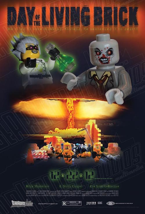
This week’s creation, “Day of the Living Brick” by Jolyrogr, is a fake movie poster for a movie I’d totally watch. Regular readers of the site probably already know I have a soft spot for fake movie posters, but even if I didn’t I’d probably still dig this creation:

I really like the composition of this. it’s well balanced, with a nice kinetic feel, and it really captures some of the awesome b-movie posters I’ve seen. The use of some of the collectible minifigures is also fantastic.
If you’re interested, you can buy a full sized version of the poster, presumably without the watermarking.
Have you seen a great zombie-related creation out on the web? Are you working on the next great zombie MOC as we speak? Well you had better let us know right away, otherwise we’ll never be able to include it here.
My favorite aspect of this is how nowhere did he ever get lazy.
Oh yeah. Lots of effort went into this.
I like this alot, though I think he could have shrunk some of the negative space a bit. For some reason it seems a little off, but none the less very great effects! I’d watch the movie!
Dumb question here….
you mean the black space? Like he could have widened the shot a bit from the bottom text to the hands of the Zed?
I really like the white space. I think it’s nice when a creation isn’t too crowded.
Gotta love the mad scientist 😀
… and the date, yeah 😀
The date is a cool detail for sure.
And he also didn’t over do it. GREAT!
Do it over?
I Mean he didn’t add to much to the poster so it was packed
Oh, yeah. I really like that too. I think there’s a tendency to just keep piling stuff on, whether the overall creation needs it or not.
I love the head from miniBIGs.com
But the watermarks get on a little on my nerves
Yeah, I really wish they weren’t there. Or at least weren’t so distracting. Ah well.
Thanks all for your awesome comments! I loved doing this poster and am working on my next idea. Had a ton of fun doing it, especially the photography and set up of all the props and minifigs. And btw, the watermarks are just for copy protection. So in the actual poster, they are not there. I’m selling this as a full size 27 inch x 40 inch poster on high quality paper. Watermark is just for the online thumbnail.
Enjoy!
I figured that was the deal with the watermarks; totally understandable if a bit distracting.
Yeah, I hated to put them on there but didn’t want people just downloading and printing out. Was kinda conflicted because yeah, they are distracting as heck.
I’m sure people understand. I hope you make a few bucks off the poster. It’s very cool.