Zombie Cliche Lookout: Catching Up
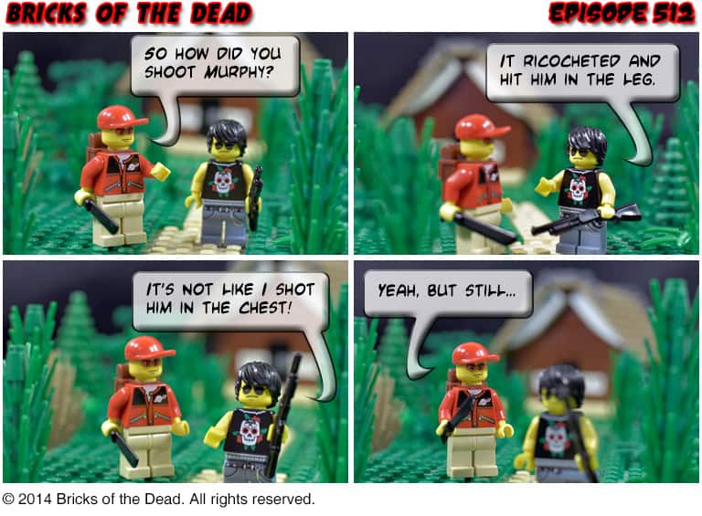
Once again we’re reaching outside the zombie genre for this episode’s cliche. This time around, it’s a simple method of stitching together multiple, concurrent story lines within the same narrative. Since I conceived of Bricks of the Dead, I wanted it to be a series that didn’t have a single main character, but rather was made up of a number of primary characters with independent stories. That necessitates that we check in with characters at different times, but whose stories overlap.
In order to do this without it being too confusing, I like to intermingle the story lines a bit, so that we see things from one set of characters’ perspective, then jump back in time a bit and see it from a different set of characters’ eyes.
About this Episode:
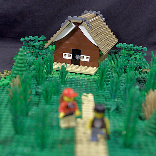
In this episode I’m trying a technique that I’ve been wanting to do for quite a while now: forced perspective. I wanted to show Stewart and Brent walking away from the cabin as a way to show that we’ve jumped back in time just a bit, and that these events are taking place around the same time as the stuff we’ve seen in the last few episodes. However, I had a couple of problems. First, there is no cabin. These episodes are shot with dollhouse-style sets, rather than any sort of complete building. I could probably build a cabin (although I’d have to buy up a lot of log bricks), but even then I just don’t have the space to shoot something that big.
So here’s my solution: tiny cabin and a shallow depth of field.
Discussion Question: Photography Techniques
I really enjoyed playing around with the forced perspective effect for today’s episode. I’m not sure how well I pulled it off, but I don’t think it’s too bad for a first attempt. So here’s the deal: what other sort of fun photography techniques do you think would work well in the comic?


Looks fantastic. I’ve seen other work doing similar things to give the illusion of a different size.
As for other techniques, perhaps a sunrise/sunset effect where you have an orangey glow from a specific side giving a nice warmness to the shot, perhaps with a bunch of zombies lurching towards the guys.
Thanks!
A silhouette against a sunrise/set would be super cool.
No, it definitely works here. You know I’m doing my the other way (complete buildings), and you’re right, it’s expensive and takes a lot of bricks. I’ve been thinking about doing something similar, as I intend an eventual scene where characters in a plane fly over the (tiny) town.
Oh man, a flyover shot would be super cool, no matter what scale you use. Good luck on that!
Typo alert, Zombie Cliche Lookout, first paragraph, last sentence: “characters are different times” are–>at 😀
Just the one typo today, it would seem, Dave’s definitely getting better! 😀
Fixed! Thanks BV.
As far as photography techniques go, I’d like to see an “aerial view” style of scene, with microscale building techniques employed strategically to show a bit of the layout of the town or whatever it’s called in your storyline so that we have a general idea of where they’ve started out and where they might be able to go. You could even have the characters appearing to hold it by the edges with their minifig hands if you copy and paste things just right, and mostly just the map is visible with very little actual background scenery or the minifigs themselves actually visible, if at all! 😀
That’s an awesome idea, and something I wanted to do earlier in the series. I’m going to have to try something like this to show the scale of a siege at some point.
I’m apparently a bit blind because I never notice the special camera angles until you explain them. So, please keep pointing them out to those of us who don’t immediately catch them. What about the “looking up” at the characters (ala Blair Witch) perspective? Or view from a tree or building? Really, just any fun perspectives are neat and mix up the comic nicely.
I’d love to do an extreme close up like that, Kim. When I can afford a longer focal-length lens, I’m going to give that a go.
Very nice setup Dave!
Photography tricks…. mmh, how about a stop motion episode? I mean, how hard could it be, right? 😉
Hah! Oh I’m sure it would be no trouble at all.
the mini-sort of variant for the cabin is both great, and very funny in a strange way.
I always find the mini-builds kind of funny looking too. It’s like they’re almost cartoonish.
I think you have achieved the ‘forced perspective’ look perfectly Dave. Nice build on the cabin as well. An option for a future shot is a horde of zombies approaching the cabin, looking over the heads of the zombies towards the cabin…..would love to see how that looks…..time to get some more zombie extras back on the scene 🙂
Looks like I need to put up a job posting.