There’s a lot of zombie stuff out there, and most of it is crap. People like to jump on bandwagons and produce quick tie-ins rather than investing love and effort into their creations. Luckily for you, I’m here to help separate the wheat from the chaff. Check back every Friday, when I’m going to share the coolest zombie-related creation I can find out there on the web.
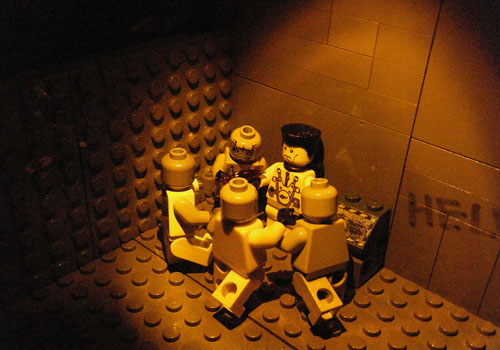
This week’s creation is Cooper Ace‘s entry in the contest: “Nazi Zombies“. It’s a rather simple set, but I think the lighting is extremely well done, and extremely creepy. I assume it’s mimicing the style of the popular Call of Duty zombie modes. In this first example, not only are the zombies closing in for the kill, but the light itself seems to be slowly constricting around this survivor.

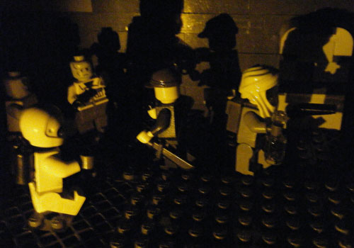
I really dig the shadows in this shot. It’s really atmospheric and creepy.

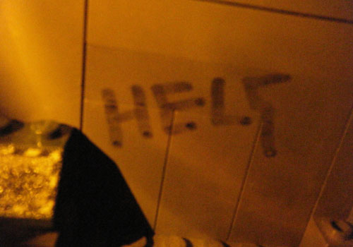
You know what I like? Little touches like this:

Have you seen a great zombie-related creation out on the web? Are you working on the next great zombie MOC as we speak? Well you had better let us know right away, otherwise we’ll never be able to include it here.
Shadows on the wall is brilliant.
Aren’t they? They just so evocative of countless horror flicks I’ve seen in my days. I love it.
I love that. The shadows on the wall always show things to gruesome to view without being scarred. they make great closings for a character’s life.
Dang. That may be the creepiest one yet. Well done, Cooper Ace. *Claps
Yeah, Cooper Ace knocks the tone right out of the park on this one. Very well done.