There’s a lot of zombie stuff out there, and most of it is crap. People like to jump on bandwagons and produce quick tie-ins rather than investing love and effort into their creations. Luckily for you, I’m here to help separate the wheat from the chaff. Check back every Friday, when I’m going to share the coolest zombie-related creation I can find out there on the web.
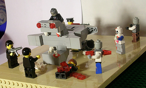
This week’s creation, “Zombie Monster MOC“, was sent in for consideration by legoped. It’s a fun little scene featuring a smartly dressed monster using zombies to sow the seeds of chaos into our midst.

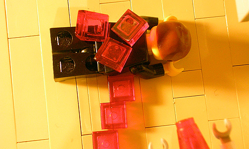
Here’s a nice close-up on the brick-built gore. Nicely done.

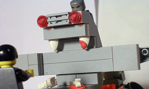
I quite like the framing on this shot; the monster appears to be bent over his controls while the humans on the ground fight off the living dead.

I just love getting things sent in from other zombie fans.
Have you seen a great zombie-related creation out on the web? Are you working on the next great zombie MOC as we speak? Well you had better let us know right away, otherwise we’ll never be able to include it here.
After seeing the last one all week, Its like putting pale color up against a Bright one on a piece of paper to see which one is most likely to go into the rainbow.
Oh yeah, they couldn’t be more different in terms of color and lighting.
Had a few ideas on some Great lighting Techniques, Involving certain kinds of paper. (color variations with different scenes) We use to do this back when I would act in School plays to add different colors, It didn’t look very good on large scale but on a smaller scale maybe it might produce a better look? I don’t know how to do pictures and everything. I don’t even know how one goes about with that A-mazing Flash light lego scene you had.
You gotta start somewhere. Break out the camera and start taking photos. Read some tutorials and try some things. Sure, you’ll take a lot of shitty photos in the beginning, but that’s how you learn. Heck, I usually take four or tive photos for every one I use.
The flashlight effects were done in Photoshop. I took a regular photo with regular lighting, added a layer for darkness, the cut away the layer for the flashlight’s beam. I added some additional effects as well, but the main concept was pretty simple.